
Everything new in Grit, on a contacts app you build in four commands
Bulk create and bulk edit as a spreadsheet grid, counted cards and charts generated per resource, a bin you can get a deleted record back from, one Operations page instead of two, one account page out from behind the System Hub, a grouped sidebar, uploads that work without Docker, and new Pulse, Sentinel and GORM Studio. Every one of them shown on a contacts app you can generate yourself in four commands.

Grit has had a long month. Entering many rows at once instead of opening the form twelve times. List pages that count the columns they actually have rather than showing the same four date windows everywhere. A bin, so deleting the wrong row is recoverable. One Operations page instead of two, one of which was empty. One account page, out from behind the System Hub where almost nobody found it. A sidebar grouped around what you open while working. Uploads that work on a machine with no Docker running. And new releases of Pulse, Sentinel and GORM Studio that let two long-standing workarounds come out of the scaffold.
This post is all of it, in order, shown on a contacts app you can generate in four commands and have open beside this page while you read.
A word first on where the list came from, because it is the only thing these changes have in common. None of them were bugs in the sense of a stack trace. They were things the framework did deliberately, and correctly, that turned out to be the wrong thing to do correctly. The storage fallback was written on purpose, with a comment explaining why it mattered, and it tested the wrong condition for a year. The account page was put under System because it is administrative, which is true and was exactly the wrong reason.
Faults like that do not surface from generating a project and reading it. They surface from living in one. Two apps built with Grit went to the Play Store this month, Stride: Team Step Challenge and Committed, both from Desishub Technologies, and between them they put a real client and a real operator in front of the admin panel every day without me in the room. That is what produced the list below.
Build the app this post is about
Everything below is shown on a contacts app. It takes four commands, and you should run them, because the whole argument of this post is that reading about a screen is not the same as opening one.
grit new contacts --triple --next --db sqlitecd contactspnpm install
Then the one resource:
grit generate resource Contact \--fields "name:string,email:email,phone:tel,company:string,status:select:lead|customer|churned,starred:bool,notes:text" \--faker --count 60
Two of those fields are doing more work than the rest, and it is worth knowing which before you see the result. status:select:lead|customer|churned and starred:bool are the only two columns in that list with a small, known set of values. Hold that thought.
grit migrategrit seedgrit start
grit seed fills sixty fake contacts, which is enough to make a chart mean something. Open http://localhost:3001, sign in with admin@example.com / admin123, and the first thing on screen is three of the changes at once.
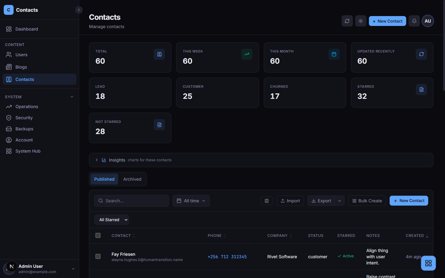 The contacts list: a grouped sidebar on the left, counted cards across the top, and an Insights panel waiting to be opened
A new project could not take an upload
The first report came from somebody building a shop. They added a product, chose a picture, and got back File storage is not configured.
There was nothing wrong with their project. Every new Grit project did this on a machine without Docker running, and had done for a long time.
The frustrating part is that the fix existed the whole time. The local disk driver has always been there. STORAGE_DRIVER=local keeps files in a folder, optimises them, makes thumbnails, signs temporary URLs and serves them from /files. It is a complete storage backend. Nothing ever reached it.
resolveStorageDriver has a fallback for exactly this case, and its own comment says what it is for: so that "a new project stores uploads before Docker is running instead of answering each one with STORAGE_UNAVAILABLE". The fallback tested whether MINIO_ACCESS_KEY was empty.
grit writes that key into .env when it creates the project. The condition could never be true. The fallback never fired once, in any project, ever.
So the scaffold pointed every new project at a MinIO that was not running, handed it credentials for that MinIO, and then disabled uploads when it did not answer. Whether the key was set was never the question anybody wanted asked.
It now asks whether MinIO answers, with a 300ms TCP dial while the config is being read, and it says out loud what it decided. If you ran the commands above without Docker, you already saw it in the log:
MinIO at http://localhost:9000 is not answering, so files are being kept on thelocal disk at storage/app and uploads work. Start it with docker compose up -dminio, or set STORAGE_DRIVER=local to choose the disk deliberately.
Two boundaries on that, both deliberate:
- Production never falls back. A production app that quietly starts writing user uploads to a container's local disk is a data loss incident with a delay fuse on it.
- Only
miniofalls back. Ans3,r2orb2endpoint that is briefly unreachable is a transient network problem, not an invitation to change where the files go.
While verifying that, a second one fell out. APP_URL is what every generated link is built from, uploaded files included. Change APP_PORT without changing APP_URL and every stored file's URL points at a port where nothing is listening. Behind a proxy a different port is correct and normal, so the warning is confined to localhost, where a mismatch is always a mistake and never anything else.
Twelve records meant opening the form twelve times
The admin had Import, for a file somebody already has, and New, for one record. The gap between them is "I have twelve of these on a bit of paper", which is most of the data entry anybody actually does.
Two buttons close it, both opening the same spreadsheet-shaped grid. On your contacts list, Bulk Create sits between Import and New.
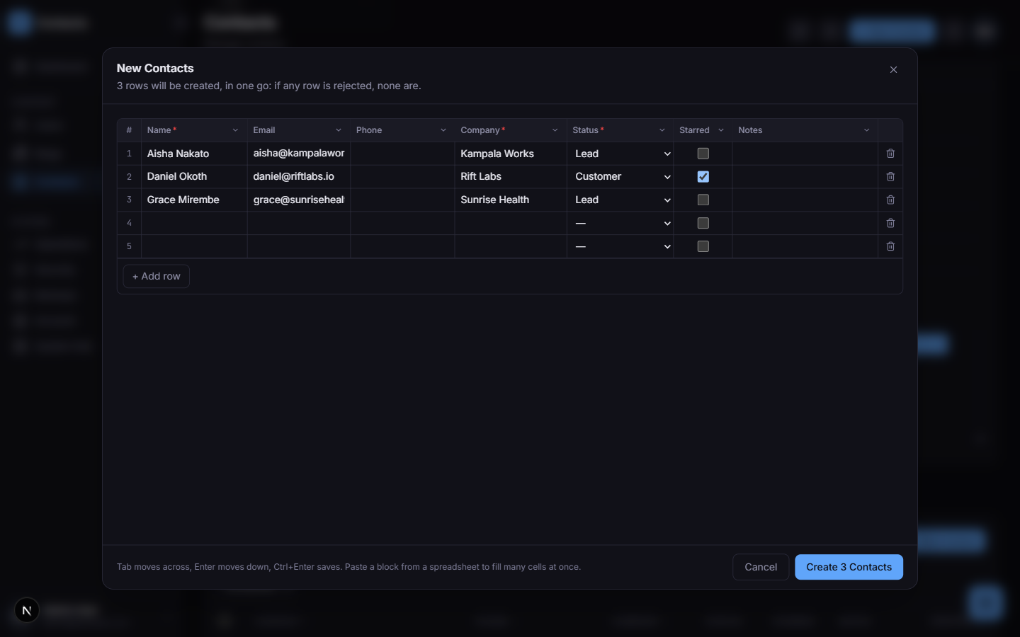 The Bulk Create grid with three rows typed in: the subtitle says they will be created in one go, and the button counts them
It opens five blank rows. Type across them, add rows as you need them, and the lot is created in one transaction: if any row is rejected, none are written. Empty rows are ignored rather than refused, because the grid starts with five and most of the time you want three, which is why the two rows you left alone above do not count and the button reads Create 3 Contacts.
Bulk Edit now opens the rows you selected as a grid at their current values, instead of applying one value to all of them. Only the cells you changed are sent, so two people editing different columns of the same row do not overwrite each other, and the button counts what will actually be written: Save 2 changed.
The keyboard matters more than the grid does, so every cell is a real input in tab order and the browser does the work:
| Key | Does |
|---|---|
Tab / Shift+Tab | walk the cells |
Enter | move down a column |
Ctrl+Enter | save |
| paste | fills a block from the cursor |
Each column header also has a fill-down button for copying the first row down the rest.
A column a cell cannot hold stays in the form. Rich text, line items, JSON and many-to-many pickers are left out, and if one of them is required the grid says so at the top rather than letting every save fail. Hide the button for a resource with table.bulkCreate: false; it already follows the resource's create permission.
The bug that only using it finds
Bulk create decodes each row with encoding/json, which knows nothing about binding: tags. So the model's own required never fired on that path.
A gadget with no category went into a table whose model requires one. Opening that row in the edit form answered Category is required, with no way to get at it.
A row you can create and cannot edit is the worst of both, and to whoever hits it it looks like the edit form is broken. respond.ValidateStruct runs the same rules gin runs on a bound request body, and bulk create now runs it per row: the grid is refused whole, with the message against the row it belongs to. That is why Name, Company and Status carry a red asterisk in the screenshot above.
Every list page showed the same four numbers
Every resource page showed a total and three date windows. Created today, this week, this month.
Those are the only questions you can ask of a table whose columns are unknown. The columns are not unknown. This is the thought I asked you to hold: the generator knows status is one of three values and starred is a boolean, and those are exactly the ones worth counting.
So now it writes them. Scroll back to the first screenshot: beside the four generic cards there is one card per status, Lead 18, Customer 25, Churned 17, and one for each side of the boolean, Starred 32, Not starred 28. Nothing configured that. The same generator run produced it, because you declared a select and a bool.
The counts ride along with the list request rather than costing a round trip each, which means they describe the rows the table is actually matching, filters included. A count that ignores the filter above it is a number in a prominent place that is wrong.
The charts, collapsed until you want them
Under the cards there is an Insights panel. Open it.
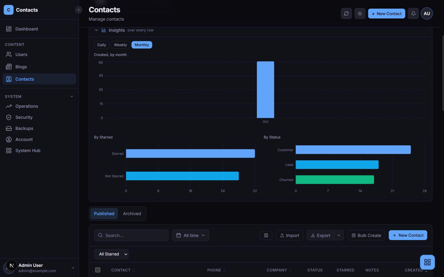 The Insights panel: a created-per-month chart, and a bar chart for each counted column
Daily, weekly or monthly for how many rows were created, and a bar chart for each counted column, which here means one for starred and one for status. It stays closed until you open it, and then remembers.
The two queries behind it are a GROUP BY each, so an ordinary visit to a list costs exactly what it did before and the expensive answer is computed only when somebody asks the question. recharts, 400 KB of it, loads at that same moment rather than riding along with every list page in the product.
The charts are drawn over the list's own query, so narrowing to one category redraws them for that category. A whole-table chart above a filtered table would be a lie told somewhere people trust.
None of this is admin-only. Two query parameters answer it on any list endpoint built on paginate.List:
GET /api/v1/contacts?series=created_at:month:12GET /api/v1/contacts?breakdown=status,starred
The first returns a count per period, the second a count per value. The series column is one of two literals and a breakdown column must already be filterable, because both reach the SQL where a bind parameter cannot go.
One detail worth naming: a week is labelled by the date of its Monday, on all three databases. Postgres and MySQL count ISO weeks and SQLite does not, so a bare week number would mean three different things depending on where the app is running.
Deleting was permanent, and it was not
Every generated resource soft-deletes. The row stayed on disk and left every list at once.
So the data was always there, and "I deleted the wrong one" still had no answer short of a SQL console. The rows accumulated forever, with nothing counting them and nothing clearing them.
Delete two contacts from your list, then open System, Trash.
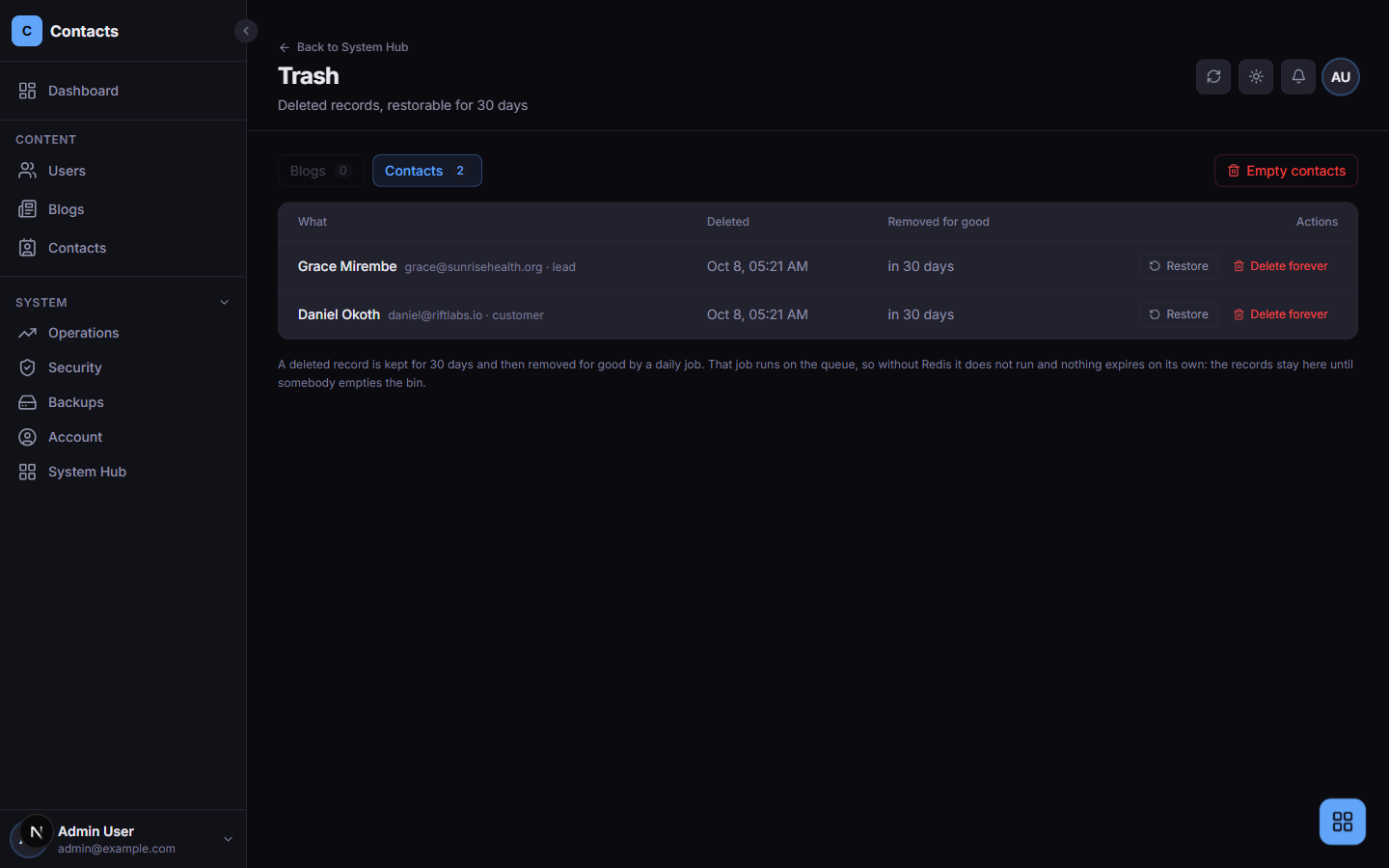 The Trash page: deleted contacts grouped by resource, each with its label, when it went and when it expires
Grouped by resource, newest first, each with a label taken from the model's own display column, when it was deleted and when it goes. Restore puts one back. Delete forever removes it now. Empty takes a whole resource, and refuses without an explicit confirm on the request.
Retention is thirty days, and a nightly task at 03:40 purges what is past it, so the table does not grow without bound whether or not anybody visits the page. The note at the bottom of that screenshot is the page being honest with you: that job runs on the queue, so on a project started without Redis nothing expires on its own and the records sit there until somebody empties the bin.
It reads the sync registry the generator already populates, so the Contact resource you generated ten minutes ago appears in the bin with no extra step. You never told it contacts existed.
Users are deliberately not in that registry. A row that carries its own role is not something a generic restore should write, so closed accounts got their own screen: System, Deleted accounts lists who closed theirs, with the role they had and the date, and restores one to signing in with the password it already had, or removes the row for good.
Erasing what a person left behind across every other table stays where it was, on the GDPR page, because it is a different operation with different law attached to it.
And an administrator can no longer close their own account. It is how an organisation locks itself out of its own admin panel, and the account that did it is the one account that could have undone it. The API refuses it with a message saying what to do instead, and the page states it rather than offering a button that returns 403 after somebody has already typed their password into the dialog behind it.
Two pages for operations, and one of them was empty
The System Hub listed two pages over the same endpoint.
/system/performance read the summary the API returns. /system/observability declared a different, richer shape, and the endpoint has never returned it. Every figure on it read data.overview.p95_ms against a response with no overview key, so a page whose subtitle promised "percentile latency, SLOs, USE grid, top N+1, errors, runtime" rendered four dashes and three empty panels. The only live thing on it came from somewhere else entirely.
They are one page now, called Operations.
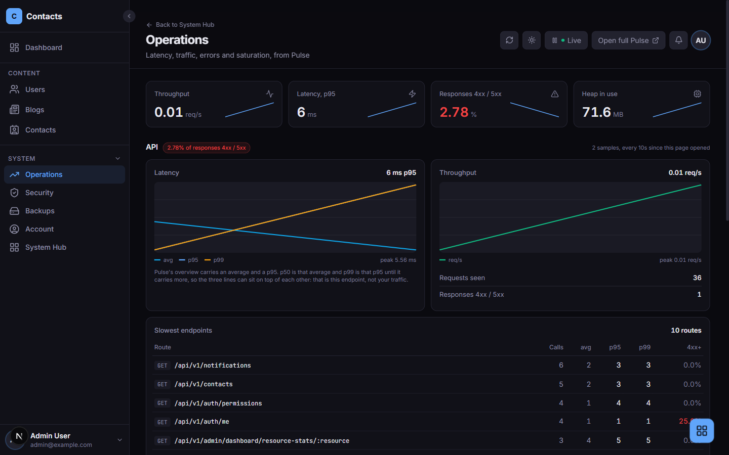 The Operations page: four tiles, latency and throughput over the session, and the slowest routes with their percentiles
Four tiles over a live window, latency and throughput charts, the slowest routes with their percentiles and error rates, Go runtime, database and cache, N+1 detections, recent errors, and the readiness report folded away at the bottom. The old URL redirects rather than 404s.
Note the line above the charts: "2 samples, every 10s since this page opened". The summary endpoint answers with the numbers as they are now and keeps no series, so the alternatives were drawing a chart from a single point or adding a metrics store to every scaffolded app. The page keeps what it has seen since you opened it and says so. Pulse's own dashboard keeps the long window, and the header links to it.
Three numbers were wrong on the way here, and each is worth naming, because each one reads as a broken application rather than a display bug:
- a route's error rate was multiplied by a hundred twice, and read
8571.4% - throughput rounded to
0.0 req/sbeside "162 requests seen", because an admin panel on a quiet morning runs at a few requests a minute, which is why the tile in that screenshot reads0.01 - a flat series was drawn along the floor of its box rather than through the middle, which reads as a collapse to nothing instead of something steady
No chart library was added for it. The lines are SVG polylines; recharts stays on the pages that have axes and tooltips.
Two pages for your account, and the better one was hidden
/profile and /system/account were the same page reached from two directions.
Profile had the avatar, your name and your job title. Account had all of that plus passkeys and sign-in links, so it was a strict superset that most people never found, because it sat behind the System Hub.
They are one page now, at /account, using the profile page's layout, with passkeys and sign-in links folded in. Both old paths redirect.
/account and not /system/account, for a reason worth stating plainly: the dashboard layout confines a user with no grants to /profile and /account. An account page living under /system bounced exactly the people whose account it is, and /account/security redirected them to a page they were not allowed to open. Signing in now lands a plain user on /account.
A few details fixed while it was being rebuilt:
- The current-password box no longer sits on the form about your name. The server asks for it only when the email changes, because that address is where a password reset is sent, so the field appears when the email is edited and not before.
- The second factor's email option says "Use OTP code via email", which names what arrives.
- The avatar uploads, crops and persists.
- Sign-in links and active sessions are two blocks with space between them, instead of one wall.
Type into the new-password box on your contacts app and the newest piece of this lands:
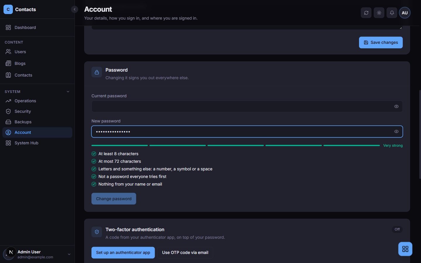 The password meter: five rungs filled, Very strong, and a check against each of the five rules
A named ladder from Very weak to Very strong, with the five rules listed underneath and a check against each one satisfied. It is on every screen that chooses a password, not just this one: sign up on all six admin auth styles, reset, both profile pages, the desktop client. Fifteen screens.
It measures guessability rather than counting rules met, which is the distinction the old bar got wrong. The old one filled one segment per rule satisfied, so a lit three of five segments. The new one calls twenty as Very weak, because every character after the first repeats the one before it and costs a guesser nothing. Passw0rd is Very weak too, because it is on the list attackers try first, whatever the composition rules say about it. And nothing the form will refuse for being too short can read above Weak, so the bar never contradicts the cross beside it.
The sidebar is grouped
The rail was Dashboard, then every resource, then one System Hub link. Anything operational was two clicks from anywhere.
Look at the left edge of any screenshot above. A Content heading over the resources, and a System group holding Operations, Security, Backups and Account beside the hub, open by default.
Four, not thirty. The test for what earns a place there is whether you open it while working rather than while configuring. Everything else stays one click further on, inside the hub, which is what a hub is for.
Pulse, Sentinel and GORM Studio moved up
All three shipped releases that close something Grit was carrying.
Pulse v1.2.0 fixes request-body capture. The error middleware used to read the body and restore only the first 4 KB, so every request carrying a Content-Length reached the handler truncated: uploads from mobile and curl failed while browsers, which send chunked, did not. It wraps the body now and passes it through whole, so the scaffold has stopped mounting Pulse with WithRequestBodyCaptureDisabled(), and error reports can say what the request carried again for the first time since v3.31.71.
GORM Studio v1.1.1 enforces TablePolicy.Hidden on the raw SQL editor, which could previously SELECT from a table the policy hid, and contains a crafted XLSX import that could panic the request.
Sentinel v2.6.0 brings Redis-backed counters, so rate limits and lockouts are counted once across replicas rather than once per process, plus whitelisted IPs and dashboard settings that survive a restart and reach every replica.
And the govulncheck allowlist is empty again. GO-2026-6452 was accepted because excelize had no fixed release; the advisory now records one, at the v2.11.0 Grit already pins, so a fresh project scans clean. An allowlist that outlives its reason is a suppression waiting to hide the next finding.
What I take from it
I said at the top that none of these were bugs in the ordinary sense, and the pattern is worth finishing.
The observability page was designed from a richer API response that was never built. The four list cards were chosen because they are the only questions you can ask without knowing the columns, by somebody who had forgotten that the generator knows the columns. Every item on this list is a decision, taken for a stated reason, that was wrong in a way no test could express.
They all survived because generating a project and reading it is not the same as living in it. A scaffold test matches strings. A type-check proves the imports resolve. Neither one has ever once told me that a page is in the wrong place, or that a number is right and useless, or that the thing somebody needs to do forty times a day takes forty form submissions.
Which is the argument for the four commands at the top. Your contacts app is still running. Delete something and get it back, type twelve rows into the grid, open the Insights panel and narrow the table underneath it to one status. It takes four minutes, and it is the only way to know whether the next thing I build is worth anything.
grit updatecd your-project && grit upgrade
If you are running anything older than v3.370.0, the upload fix alone is worth it, and you probably have a MinIO in your .env that has never answered.
Founder of Grit and author of The Daily Grit. A 5-minute morning read on building full-stack apps with Go + React.
Build it with Grit
Go + React, batteries included. Scaffold a production-ready app in one command.
Get started