
Your table, our machinery
You bought a dashboard template and you want its pages in your admin, without giving up URL-synced sorting, paging, filters, selection, bulk actions, toasts and cache invalidation. Grit's customisation system in eight levels, from patching one cell to replacing the page. For each one: what you get by default, why you would want to change it, and exactly how, with every snippet labelled with the file it belongs in.
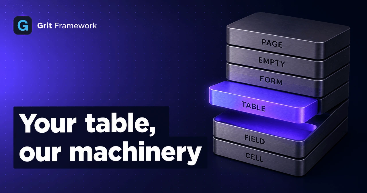
Here is the situation Grit's customisation system was built for.
You ran grit g resource Product and got a working admin page in one command:
a searchable, sortable table, a form, stat cards, pagination, CSV import, an
exporter, bulk delete behind a confirm dialog. It works. It is also the Grit
table, and you paid $79 for a template whose table looks better, or your
designer has opinions, or the client's brand book exists.
The old answer was: write the page yourself. Which meant writing all of it yourself, because the sorting was in the page, and the pagination was in the page, and the URL sync was in the page, and the toast on a successful delete was in the page. You wanted to change the markup and the price was reimplementing the machinery.
That is the thing this fixes. Eight levels, each one bigger than the last, and you stop climbing the moment you have what you need. For each level: what you get by default, why you would change it, and how.
Everything below comes from a real app: portkit, three resources, built to
exercise every level. The code is copied from it, not written for the post.
Level 0: the two files
A generated resource is two files that sit next to each other:
apps/admin/resources/index.ts # the registry: every resource, in one arrayproducts/products.ts # generated: rewritten on every grit generateproducts.custom.tsx # yours: created once, never touched againusers/users.tsusers.custom.tsx
One folder per resource, which is newer than the split itself: the overlay
doubled the number of files in resources/, and twenty resources flat is forty
files in one directory with the two halves of each one sorted apart from each
other. If your project predates v3.143.0, grit upgrade moves them and rewrites
the imports.
The first file is configuration: columns, form fields, filters, stats. It is a
.ts file and the generator rewrites it freely, because nothing of yours is in
it. The second is a .tsx file that the generator creates once and then never
opens again.
That split is the whole trick. Configuration cannot hold a React component, and
anything holding a React component cannot be safely regenerated. So they live
apart, and defineResource() merges them:
// products.ts, the last line}, custom);
Everything from here on goes in the second file.
Level 1: patch a cell
What you get by default
Every column runs through one renderer. If the column declares a format, that
format decides the markup; otherwise the value is stringified:
// components/tables/cell-renderers.tsx, roughlyswitch (column.format) {case "badge": return <BadgeCell value={String(value)} config={column.badge} />case "currency": return <CurrencyCell value={Number(value)} prefix={column.currencyPrefix} />case "date": return <DateCell value={String(value)} />case "relative": return <RelativeCell value={String(value)} /> // "2m ago"case "boolean": return <BooleanCell value={Boolean(value)} />case "image": return <ImageCell value={String(value)} />case "link": case "email": case "user": case "color": case "richtext": ...default: return String(value)}
There are fourteen formats, they cover a lot, and the generator picks sensible
ones: a created_at column comes out as format: "relative" without you asking.
Why you would change it
Because a format is a fixed idea of what a value looks like, and yours is specific. Three from the product table:
priceis afloat64in Go, so it arrives as814.29and renders as814.29. Thecurrencyformat prefixes a symbol; it does not group thousands, use your locale, or set the digits in a tabular font so the column aligns down the page.statusis a three-value union. Thebadgeformat can colour it, but the palette is Grit's, not the one in your brand book.stockis an integer. No format says "and show me how close to zero that is", because that is a decision about your domain.
The rule of thumb: reach for a custom cell when the markup depends on something the framework cannot know. Your currency. Your thresholds. Your palette.
How
import type { ResourceCustomisation } from "@/lib/resource";import type { Product } from "@repo/shared/types";const money = new Intl.NumberFormat("en-US", { style: "currency", currency: "USD" });const custom: ResourceCustomisation<Product> = {columns: {price: {cell: (row) => (<span className="font-mono tabular-nums">{money.format(row.price)}</span>),},stock: { cell: (row) => <StockBar value={row.stock} /> },status: { cell: (row) => <StatusPill value={row.status} /> },},};export default custom;
Three things worth pointing at.
row is a Product. Not Record<string, unknown>. row.price is a
number, so money.format type-checks; row.prise is a compile error. The type
comes from @repo/shared/types: the same interfaces grit sync generates from
your Go structs, so there is no second definition to keep in step. Rename a field
in Go, run grit sync, and every stale renderer lights up red instead of
rendering a blank cell in production.
Patches are merged by key, not applied wholesale. price here means "take
the generated price column and override its cell": the label, the sortable
flag and everything else survive. That is deliberate. grit sync keeps adding
new columns as your Go model grows, and it can do that without stepping on your
renderers. A key that matches no column is simply ignored.
Nothing else changed. Sorting still works on those columns, because sorting
is a server-side sort_by parameter and has nothing to do with how a cell draws.
Search still works. The exporter still exports the underlying values, not your
markup. You replaced three functions, not a page.
The one-line habit worth forming
row.status is typed "active" | "draft" | "archived", because that is what the
Go struct declares. The value arriving at your renderer came out of a database,
which picks things up from CSV imports, migrations and hand-written UPDATEs
that no type ever saw.
const s = STATUS[row.status] ?? UNKNOWN;
Without the ??, one unexpected value is undefined, and reading .className
off it takes the whole table down in front of whoever opened the page. I know
because I did exactly that, and the row that broke it said "moreover".
Level 2: patch a field
What you get by default
The generator reads your Go struct and picks a field type per column: string
becomes text, text becomes a textarea, bool becomes a toggle, float
becomes a number input with numberKind: "float", and select:a|b|c becomes a
dropdown carrying its own options. The label is the column name in title case.
required comes from whether the Go field is non-pointer and non-optional.
// products.ts, generated{ key: "sku", label: "Sku", type: "text", required: true },{ key: "stock", label: "Stock", type: "number", numberKind: "int" },
Why you would change it
Because a Go struct has no room for the things that make a form usable. It
cannot say that an SKU looks like PK-0000, that stock can never be negative,
or that this number gets printed on a picking slip so getting it wrong has a
physical consequence. It also cannot fix "Sku", which is what title-casing an
acronym gets you.
How
fields: {sku: {label: "SKU",placeholder: "PK-0000",description: "Uppercase, no spaces. Printed on the picking slip.",},stock: { min: 0, description: "Units on hand right now." },},
Merged by key, same as columns, so the type and the required flag still come from the generator and keep tracking the Go model.
You could also just fix the label in products.ts, and it would survive
grit sync, which only ever inserts between its markers. It would not survive
a full grit generate resource of the same resource, which rewrites that file
from scratch. The overlay survives both. That is the difference between the two
files in one sentence.
Level 3: replace the table
What you get by default
DataTable: a <table> with a sortable header row, an optional select-all
checkbox column, one cell per visible column, and a trailing actions column with
view, edit and delete. It handles the loading skeleton and the built-in empty
state. It receives everything as props and owns no state at all.
<DataTablecolumns={c.columns} data={c.rows}isLoading={c.isLoading}sortBy={c.sortBy} sortOrder={c.sortOrder} onSort={c.setSort}selectedRows={c.selection} onSelectRows={c.setSelection}onView={c.view} onEdit={c.edit} onDelete={c.remove}rowActions={resource.table.rowActions}/>
Why you would change it
Not because it looks different from your template. Change a border radius in
globals.css and the stock table follows. Change it when the shape is wrong:
your data is not a grid.
An enquiry is a message. A message list wants a subject line, a sender under it, a preview under that, and a priority tag on the right. That is not a table with four columns, it is a list of three-line items, and no amount of cell styling turns one into the other. Same story for a product grid of image cards, a calendar of bookings, a file browser.
How
components: {Table: InboxList,},
InboxList receives exactly the props DataTable receives:
function InboxList({ data, isLoading, onEdit, onSort, sortBy, sortOrder }: ResourceTableProps<Enquiry>) {if (isLoading) return <Spinner />;return (<ul className="divide-y divide-border">{data.map((row) => (<li key={row.id}><button onClick={() => onEdit?.(row)} className="..."><p className="font-medium">{row.subject}</p><p className="text-xs text-text-secondary">{row.requester}</p></button></li>))}</ul>);}
Data in, events out. No fetching, no paging state, no sort state: onSort is
handed to you and the controller above deals with the consequences. Note that
columns arrives too and this component ignores it. An inbox has a shape, not
columns, and nothing forces you to use a prop you do not want.
Two responsibilities move to you. The loading state, because isLoading is
now yours to branch on, and the sort affordance, because there is no header row
to click. The inbox handles the second with one button that toggles
onSort("created_at"). Skip both and the list flashes empty while loading and
cannot be reordered, and nothing will warn you.
What stays: the page header, the stat cards, the search box, the date filter, the column picker, the exporter, the importer, the pagination, and both confirm dialogs. You replaced the middle of the page.
Level 4: replace the form
This is the level with the most moving parts, so it gets the most detail.
What you get by default
FormSheet (or FormModal, or a full page, depending on formView) wraps
FormBuilder, which is a loop over resource.form.fields rendering one field
component per entry. Here is what it actually does, piece by piece.
State is react-hook-form, uncontrolled. One
useForm call at the top, each field wrapped in a Controller:
const { control, handleSubmit, formState: { errors } } = useForm({defaultValues: buildDefaults(formDef.fields, defaultValues),});
Uncontrolled means typing in a field does not re-render the form. On a twenty-field resource that is the difference between a form that feels instant and one that stutters.
Receiving data is buildDefaults, and it is more careful than it looks. For
each field it takes the value from the record if the key is present, then falls
back to the field's defaultValue, then to a type-appropriate empty:
if (field.key in existing) defaults[key] = existing[field.key]else if (field.defaultValue !== undefined) defaults[key] = field.defaultValueelse if (toggle or checkbox) defaults[key] = falseelse if (an array field type) defaults[key] = []else if (a file-object field type) defaults[key] = nullelse defaults[key] = ""
That type-aware fallback matters. React logs a warning and flips an input
between controlled and uncontrolled if you hand undefined to a checkbox, and a
file field given "" instead of null renders a broken preview.
For a multi-relationship field it does one more thing. The API returns nested
objects ({ tags: [{ id, name }] }) and the picker wants ids, so it maps
related.map(r => r.id) on the way in.
item is the whole mode switch: null means create, a record means edit. There
is no separate mode prop.
Validation is deliberately thin. FormBuilder attaches exactly one rule:
rules={field.required ? { required: `${field.label} is required` } : undefined}
Required, and nothing else. No length, no pattern, no cross-field check. The
error renders under its field from errors[field.key]?.message.
The real validation is on the server, and that is on purpose, because an admin panel is not the only thing that talks to your API. The Go handler binds the request struct and returns 422 on failure:
{ "error": { "code": "VALIDATION_ERROR", "message": "Key: 'CreateEnquiryRequest.Subject' Error:..." } }
There is also a generated Zod schema at packages/shared/schemas/enquiry.ts
with the real rules in it, mirrored from the Go struct. The stock admin form does
not use it. Hold that thought.
Submission is two hooks and a callback:
const { mutate: create } = useCreateResource(resource.endpoint, "Enquiry");const { mutate: update } = useUpdateResource(resource.endpoint, "Enquiry");const handleSubmit = (data) => {if (isEdit) update({ id: String(item.id), body: data }, { onSuccess: () => onClose() });else create(data, { onSuccess: () => onClose() });};
Each hook is a React Query mutation that POSTs or PUTs, invalidates the query key
for that endpoint on success, and raises a toast. On failure it reads
error.response.data.error.message and toasts that instead, so a server
rejection is visible without any wiring. The list behind the dialog refetches
itself, because it is watching the same key.
Why you would change it
Four reasons, in rough order of how often they come up.
- The layout is wrong. Your template's form is two columns with a preview
pane, or a sticky footer, or grouped cards.
formViewandlayoutcover sheet, modal, page, wizard and two-column, but not everything. - You need a field type that does not exist. A colour picker, a map coordinate, an address autocomplete, a dependent dropdown where the second select is filtered by the first.
- You want real client-side validation. Required-only is a low bar. If the server is going to reject a malformed email, saying so before the round trip is better.
- The form is not a form. A composer, a wizard driven by your own state machine, a canvas.
Reasons 1 and 2 often have cheaper answers, so check those first. A two-column
layout is layout: "two-column" in the resource. A one-off field type is often a
text field plus a description. Replace the whole form when you are actually
changing its behaviour.
How
components: {Form: Composer,},
Your component receives three props and nothing else:
interface ResourceFormProps<T> {resource: ResourceDefinition; // endpoint, labels, and the field config if you want ititem: T | null; // null = create, record = editonClose: () => void; // call on cancel AND on successful save}
Which means you now own the four things the stock form was doing. Here is each one.
State
Yours. useState is fine for a small form and is what the example below uses. If
your template ships a form built on react-hook-form, keep it and pass item into
defaultValues. The framework does not care which you pick.
function Composer({ resource, item, onClose }: ResourceFormProps<Enquiry>) {const [form, setForm] = useState({subject: item?.subject ?? "",requester: item?.requester ?? "",priority: item?.priority ?? "normal",body: item?.body ?? "",resolved: item?.resolved ?? false,});
Note the ?? on every line. This is buildDefaults done by hand, and the same
trap applies: resolved: item?.resolved on its own yields undefined on create,
which makes the checkbox uncontrolled on first render and controlled after the
first click. React will tell you so in the console, once, and then the state will
quietly not work.
Receiving data
The item prop is the record, already fetched. You do not need to load anything
for the row itself.
If your form needs data the row does not carry, a list of assignable users for example, fetch it with the same hook the rest of the admin uses:
const { data: users } = useResource<User>("/api/users", { pageSize: 100 });
For a nested relation, remember the shape the API returns. item.tags is an
array of objects, not ids, so a multi-select wants
item.tags?.map(t => t.id) ?? []. This is the one place the stock form is doing
something non-obvious on your behalf, and the one place a hand-written form most
often gets it wrong.
Validation
Now you can do the thing the stock form does not: use the Zod schema that is already generated from your Go struct.
import { CreateEnquirySchema } from "@repo/shared/schemas";const [errors, setErrors] = useState<Record<string, string>>({});const submit = (e: React.FormEvent) => {e.preventDefault();const parsed = CreateEnquirySchema.safeParse(form);if (!parsed.success) {// One entry per failing field, keyed the same way your inputs are.setErrors(Object.fromEntries(parsed.error.issues.map((i) => [String(i.path[0]), i.message])));return;}setErrors({});save(parsed.data);};
This is worth doing even though the server validates too, and it is worth
understanding why. The schema and the Go request struct are generated from the
same source, so they cannot drift: add a field in Go, run grit sync, and the
Zod schema grows the rule at the same moment the request struct does. You are not
maintaining a second copy of the rules, you are reusing the first copy earlier.
Use UpdateEnquirySchema when item is set. The update variant marks everything
optional, which is what an edit that sends only what changed actually needs.
Submission
The same two hooks the stock form uses, exported for exactly this:
const create = useCreateResource(resource.endpoint, "Enquiry");const update = useUpdateResource(resource.endpoint, "Enquiry");const saving = create.isPending || update.isPending;const save = (body: Record<string, unknown>) => {const done = { onSuccess: () => onClose() };if (item) update.mutate({ id: item.id, body }, done);else create.mutate(body, done);};
Cache invalidation and both toasts come for free, because they live in the hook rather than in the form. Three details that matter:
- Call
onClose()on success, not before.onCloseclears the controller's form state. Calling it optimistically closes the dialog over a request that may still fail, and the error toast then arrives with no context. - Disable the submit button on
isPending. Nothing else stops a double submit, and two POSTs make two records. - A server rejection already toasts. If you want it inline instead, read it
off the error in your own
onErrorand merge it into your error state:
update.mutate({ id: item.id, body }, {onSuccess: () => onClose(),onError: (err) => {const msg = err?.response?.data?.error?.message;if (msg) setErrors((prev) => ({ ...prev, _form: msg }));},});
Generated handlers return a single message for a 422 rather than a per-field
map, so that belongs at the top of the form rather than under a specific input.
Per-field server errors mean widening the handler, which is a Go change, not a
form one.
A third option, before you write any of that
If all you want is a different shell around the stock fields, do not replace the
form. Import FormBuilder and hand it the resource's own field list. You keep
every field type, the required rules, the layout engine and the nested-relation
handling, and you supply the frame:
function Composer({ resource, item, onClose }: ResourceFormProps<Enquiry>) {const create = useCreateResource(resource.endpoint, "Enquiry");const update = useUpdateResource(resource.endpoint, "Enquiry");return (<TemplateDrawer title={item ? "Edit enquiry" : "New enquiry"} onClose={onClose}><FormBuilderform={resource.form}defaultValues={(item ?? {}) as Record<string, unknown>}isSubmitting={create.isPending || update.isPending}onCancel={onClose}onSubmit={(data) => {const done = { onSuccess: () => onClose() };if (item) update.mutate({ id: item.id, body: data }, done);else create.mutate(data, done);}}/></TemplateDrawer>);}
That is the entire stock form with your chrome around it, in about fifteen lines, and it keeps tracking your Go model as the model changes. Try this before writing inputs by hand.
The whole file, assembled
That is four slots' worth of decisions spread across three levels, so here is
enquiries.custom.tsx in one piece. The list came from Level 3, the composer
from this one, and the empty state is Level 5, three sections down: it is
included here so the file is whole rather than correct-in-fragments.
This is the real file out of a running app, not a sketch. It type-checks, it blocks an empty submit with two inline "Required" messages that come from the generated schema, and a valid submit saves, closes the dialog and appears in the list behind it.
"use client";import { useState } from "react";import type {ResourceCustomisation,ResourceFormProps,ResourcePageSlotProps,ResourceTableProps,} from "@/lib/resource";import type { Enquiry } from "@repo/shared/types";import { CreateEnquirySchema, UpdateEnquirySchema } from "@repo/shared/schemas";import { useCreateResource, useUpdateResource } from "@/hooks/use-resource";import { buttonClasses } from "@/components/ui/button";import { Check, Inbox, Loader2, Mail } from "@/lib/icons";/*** Enquiries: three slots at once, which is what porting a bought template* actually looks like. Their list, their composer, their empty state.** Note what is NOT here. No fetching, no paging, no search box, no sort state.* The table below is handed rows and callbacks and returns markup; the page* around it is still the stock one, so the toolbar, the date filter, the* exporter, the bulk bar and the pagination all keep working.*/const PRIORITY: Record<Enquiry["priority"], string> = {high: "bg-red-700 text-white",normal: "bg-blue-700 text-white",low: "bg-gray-600 text-white",};const UNKNOWN_PRIORITY = "bg-gray-500 text-white";// ── 1. The list ────────────────────────────────────────────────────────// Props are DataTable's, unchanged. `columns` is ignored here on purpose: an// inbox has a shape, not columns. Sorting still routes through onSort.function InboxList({data,isLoading,onEdit,onSort,sortBy,sortOrder,}: ResourceTableProps<Enquiry>) {if (isLoading) {return (<div className="flex items-center justify-center gap-2 py-16 text-sm text-text-secondary"><Loader2 className="h-4 w-4 animate-spin" />Loading enquiries...</div>);}return (<div><div className="flex items-center justify-between border-b border-border px-4 py-2"><span className="text-xs uppercase tracking-wide text-text-muted">{data.length} in view</span><buttononClick={() => onSort?.("created_at")}className="text-xs text-text-secondary hover:text-text-primary">Newest {sortBy === "created_at" && sortOrder === "asc" ? "last" : "first"}</button></div><ul className="divide-y divide-border">{data.map((row) => (<li key={row.id}><buttononClick={() => onEdit?.(row)}className="flex w-full items-start gap-3 px-4 py-3 text-left hover:bg-bg-hover"><spanaria-hidden="true"className={"mt-1 h-2 w-2 shrink-0 rounded-full " +(row.resolved ? "bg-emerald-600" : "bg-amber-600")}/><div className="min-w-0 flex-1"><div className="flex items-center gap-2"><p className="truncate text-sm font-medium text-text-primary">{row.subject}</p>{/* ?? UNKNOWN_PRIORITY: the type says three values, thedatabase says whatever an import put there. */}<spanclassName={"rounded-full px-2 py-0.5 text-[11px] font-medium " +(PRIORITY[row.priority] ?? UNKNOWN_PRIORITY)}>{row.priority}</span></div><p className="truncate text-xs text-text-secondary">{row.requester}</p><p className="mt-1 line-clamp-1 text-xs text-text-muted">{row.body}</p></div>{row.resolved && (<span className="mt-1 flex shrink-0 items-center gap-1 text-xs text-emerald-700 dark:text-emerald-400"><Check className="h-3.5 w-3.5" />Resolved</span>)}</button></li>))}</ul></div>);}// ── 2. The composer ────────────────────────────────────────────────────// A replacement form owns its own state, validation and saving. The hooks the// stock form uses are exported, so "owns its own saving" is four lines.function Composer({ resource, item, onClose }: ResourceFormProps<Enquiry>) {// ?? on every line. This is buildDefaults by hand, and the same trap// applies: `resolved: item?.resolved` alone is undefined on create, which// makes the checkbox uncontrolled on first render and controlled after the// first click.const [form, setForm] = useState({subject: item?.subject ?? "",requester: item?.requester ?? "",priority: item?.priority ?? ("normal" as Enquiry["priority"]),body: item?.body ?? "",resolved: item?.resolved ?? false,});const [errors, setErrors] = useState<Record<string, string>>({});const create = useCreateResource(resource.endpoint, "Enquiry");const update = useUpdateResource(resource.endpoint, "Enquiry");const saving = create.isPending || update.isPending;const save = (body: Record<string, unknown>) => {const onError = (err: unknown) => {// Generated handlers return one message for a 422 rather than a// per-field map, so it belongs at the top of the form.const msg = (err as { response?: { data?: { error?: { message?: string } } } })?.response?.data?.error?.message;if (msg) setErrors((prev) => ({ ...prev, _form: msg }));};// onSuccess, not before: onClose clears the controller's form state, and// closing optimistically hides the dialog over a request that may fail.if (item) update.mutate({ id: item.id, body }, { onSuccess: () => onClose(), onError });else create.mutate(body, { onSuccess: () => onClose(), onError });};const submit = (event: React.FormEvent) => {event.preventDefault();// The Zod schema generated from the Go struct, so these rules cannot drift// from the ones the server enforces. Update marks everything optional,// which is what an edit sending only what changed needs.const schema = item ? UpdateEnquirySchema : CreateEnquirySchema;const parsed = schema.safeParse(form);if (!parsed.success) {setErrors(Object.fromEntries(parsed.error.issues.map((i) => [String(i.path[0]), i.message])),);return;}setErrors({});save(parsed.data as Record<string, unknown>);};const field ="w-full rounded-lg border border-border bg-bg-primary px-3 py-2 text-sm text-text-primary focus:border-accent focus:outline-none";return (<div className="fixed inset-0 z-50 flex items-center justify-center bg-black/60 p-4"><formonSubmit={submit}className="w-full max-w-lg rounded-xl border border-border bg-bg-secondary shadow-xl"><header className="flex items-center gap-2 border-b border-border px-5 py-4"><Mail className="h-4 w-4 text-accent" /><h2 className="text-sm font-semibold text-text-primary">{item ? "Edit enquiry" : "New enquiry"}</h2></header><div className="space-y-4 px-5 py-4">{errors._form && (<p className="rounded-lg bg-danger/10 px-3 py-2 text-sm text-danger">{errors._form}</p>)}<label className="block"><span className="mb-1 block text-xs font-medium text-text-secondary">Subject</span><inputvalue={form.subject}onChange={(e) => setForm({ ...form, subject: e.target.value })}className={field}/>{errors.subject && <span className="text-xs text-danger">{errors.subject}</span>}</label><div className="grid grid-cols-2 gap-3"><label className="block"><span className="mb-1 block text-xs font-medium text-text-secondary">Requester</span><inputvalue={form.requester}onChange={(e) => setForm({ ...form, requester: e.target.value })}className={field}/>{errors.requester && <span className="text-xs text-danger">{errors.requester}</span>}</label><label className="block"><span className="mb-1 block text-xs font-medium text-text-secondary">Priority</span><selectvalue={form.priority}onChange={(e) =>setForm({ ...form, priority: e.target.value as Enquiry["priority"] })}className={field}><option value="low">Low</option><option value="normal">Normal</option><option value="high">High</option></select></label></div><label className="block"><span className="mb-1 block text-xs font-medium text-text-secondary">Message</span><textarearows={5}value={form.body}onChange={(e) => setForm({ ...form, body: e.target.value })}className={field}/></label><label className="flex items-center gap-2 text-sm text-text-primary"><inputtype="checkbox"checked={form.resolved}onChange={(e) => setForm({ ...form, resolved: e.target.checked })}className="h-4 w-4 rounded border-border accent-accent"/>Mark as resolved</label></div><footer className="flex justify-end gap-2 border-t border-border px-5 py-4"><buttontype="button"onClick={onClose}className={buttonClasses({ variant: "secondary", size: "sm" })}>Cancel</button>{/* Disabled while pending: nothing else stops a double submit, andtwo POSTs make two records. */}<button type="submit" disabled={saving} className={buttonClasses({ size: "sm" })}>{saving && <Loader2 className="h-4 w-4 animate-spin" />}{item ? "Save changes" : "Create enquiry"}</button></footer></form></div>);}// ── 3. The empty state ─────────────────────────────────────────────────// Rendered instead of the list when the query has finished and returned// nothing. "And finished": a loading table is not an empty one.function EmptyInbox({ resource }: ResourcePageSlotProps) {return (<div className="flex flex-col items-center justify-center gap-3 px-6 py-20 text-center"><span className="rounded-full bg-bg-tertiary p-4"><Inbox className="h-6 w-6 text-text-secondary" /></span><h2 className="text-base font-semibold text-text-primary">Inbox zero</h2><p className="max-w-sm text-sm text-text-secondary">No one has written in. New {resource.label?.plural.toLowerCase()} land here the moment thecontact form is submitted.</p></div>);}const custom: ResourceCustomisation<Enquiry> = {components: {Table: InboxList,Form: Composer,EmptyState: EmptyInbox,},};export default custom;
Level 5: replace the empty state
What you get by default
TableEmptyState: a centred icon, "No records found", and a line suggesting you
create one. It renders inside the table body when data.length === 0.
Why you would change it
Because the default is honest but useless. A first-run admin is the worst possible first impression: a client logs in, sees "No records found", and has no idea whether the app is broken, still importing, or simply new. The empty state is the one screen guaranteed to be seen on day one, and it is the cheapest place to explain how the data is supposed to arrive.
How
EmptyState: ({ resource }) => (<div className="flex flex-col items-center gap-3 py-20 text-center"><Inbox className="h-6 w-6 text-text-secondary" /><h2 className="font-semibold">Inbox zero</h2><p className="text-sm text-text-secondary">No one has written in. New {resource.label?.plural.toLowerCase()} land herethe moment the contact form is submitted.</p></div>),
Rendered instead of the table when the query has finished and returned nothing. Note "and finished": a loading table is not an empty one, and the slot knows the difference, so this never flashes during the first fetch.
One thing it deliberately does not replace is the toolbar. The search box stays, which means an empty state caused by a filter still shows you the filter that caused it.
Level 6: replace the whole page
What you get by default
ResourcePage: a header, stat cards, a toolbar, optional filters, the table, and
pagination, in that order, with the dialogs after them. It is markup and nothing
else. Every value it renders comes from one hook.
Why you would change it
When the page is not a list of records. A pipeline is four columns of cards. A scheduling screen is a week grid. A support queue is a two-pane split with the list on the left and the conversation on the right. None of those have a sensible "table" to swap at Level 3, because the layout itself is the feature.
The trap to avoid: reaching for Level 6 because you want a different header, or your own toolbar. If you find yourself rebuilding pagination inside a Page slot, you wanted Level 3.
How
function PipelineBoard({ resource }: ResourcePageSlotProps) {const c = useResourceController<Deal>(resource, { initialPageSize: 100 });const { mutate: patch } = usePatchResource(resource.endpoint, "Deal");const byStage = useMemo(() => {const buckets = new Map(STAGES.map((s) => [s.key, [] as Deal[]]));for (const deal of c.rows) buckets.get(deal.stage)?.push(deal);return buckets;}, [c.rows]);// ...four columns of cards, a total per stage, buttons that move a deal along}const custom: ResourceCustomisation<Deal> = {components: { Page: PipelineBoard },};
useResourceController is the hook the stock page is built on. It returns
everything and renders nothing:
| Data | rows, meta, total, totalPages, isLoading |
| Query state | page, pageSize, search, sortBy, sortOrder, filters, dateRange and a setter for each |
| Columns | columns (visible), allColumns, hiddenColumns, toggleColumn |
| Selection | selection, setSelection, clearSelection |
| Actions | create, edit, view, remove, bulkRemove, can |
| Dialogs | form, confirmDelete, confirmBulkDelete, importer |
| Odds and ends | stats, apiSearchParams, singularName, pluralName |
The date filter writes itself into the address bar with replace rather than
push, so a shared link rehydrates the same view and the back button does not
collect one entry per filter tweak. Changing the search resets to page 1, because
searching from page 7 otherwise lands you on an empty page 7 of two results. The
stat cards inherit the active date range, so "Total: 10,000" cannot sit above a
table showing 142 matches.
None of that is code you write. All of it is code you would have had to.
Note initialPageSize: 100 in the example. A kanban that paginates is a kanban
nobody trusts, and the option exists for exactly this.
Why trust that the hook is complete
Because the stock page is built on it and contains no state of its own. If the controller were missing something, the default page could not exist. So anything the default page can do, yours can too. That is not a promise, it is the file layout.
What a Page slot does inherit
Responsibility for its dialogs. The stock page renders the form container and the
two confirm modals; replace the page and that goes with it. The state does not,
it is still in the controller, so you keep calling c.create, c.edit and
c.remove from your own buttons and render the stock dialogs off the flags:
{c.form.open && (<FormSheet resource={resource} item={c.form.item} onClose={c.form.close} />)}<ConfirmModalopen={c.confirmDelete.open}onConfirm={c.confirmDelete.confirm}onCancel={c.confirmDelete.cancel}title="Delete Deal"variant="danger"loading={c.isDeleting}/>
A kanban card's delete button calls c.remove(deal.id), the modal opens, confirm
runs the mutation, the toast fires, the query invalidates, the board re-renders.
You wrote the card.
For anything outside plain CRUD, reach for the mutation hooks directly. Moving a deal between stages is one field, so it is a PATCH:
const move = (deal: Deal, delta: number) => {const next = STAGES[STAGES.findIndex((s) => s.key === deal.stage) + delta];if (next) patch({ id: deal.id, body: { stage: next.key } });};
usePatchResource invalidates the same query key as everything else, so the
board redraws itself. The Go handler whitelists writable columns and drops the
rest, which is what makes sending a one-key body safe.
Level 7: tabs above the table
What you get by default
Nothing. A generated table has a search box, a date window and whatever
filters you declared, which render as dropdowns above the rows.
Why you would change it
Because the two or three views people actually use are not worth a dropdown.
"Unpaid" is not a different page, it is this page with status=pending, and
a tab says that where a dropdown hides it behind a click. The screenshot you
were sent almost certainly has tabs across the top of the table, and now so can
yours.
How
Config, so it goes in the definition rather than the overlay:
table: {tabs: [{ key: "all", label: "All", count: true },{ key: "unpaid", label: "Unpaid", filters: { status: "pending" }, count: true },{ key: "shipped", label: "Shipped", filters: { status: "shipped" }, count: true },{ key: "refunds", label: "Refunds", filters: { status: "refunded" }, icon: "Undo2" },],}
The first tab is selected on load, and a tab with no filters clears them,
which is what makes "All" work without a special case. Choosing one resets to
page one and clears the selection, because the rows underneath are not the same
rows any more.
Tab filters merge under the operator's own, so picking Unpaid and then filtering by customer narrows the tab instead of quietly replacing it.
count: true fetches that tab's own total. It is opt-in per tab because each
one is a request, and the badge appears only once the number arrives: a tab
that says 0 and then says 47 is worse than a tab that said nothing for a
moment.
It is a real tablist, so Left and Right move between tabs and Tab leaves the group. That is not pedantry. Without roving focus a keyboard user stops at every tab on the way to the table, and with six tabs that is six stops before reaching the thing being filtered.
If your tabs render but do not filter, the resource predates v3.144.0: the API
whitelists which columns may be filtered from the query string, and
grit generate resource regenerates the handler with that list.
Need a tab a config array cannot express, like one scoped to the signed-in
user? Use the Page slot and drive it from the controller:
const c = useResourceController<Order>(resource);// c.tabs the presets from the definition// c.activeTab the key currently applied// c.setActiveTab(key)
Level 8: bulk actions
What you get by default
Tick some rows and a bar appears, fixed to the bottom of the window. Five built-ins, and you choose which of them a resource offers:
table: {bulkActions: ["edit", "archive", "restore", "export", "delete"],}
edit writes one field to every selected row. archive puts rows away without
destroying them: they leave the list, keep their data, and come back with one
click from the Archived tab that appears alongside Published. delete is the
same soft delete as the per-row one.
Why you would change it
Because the useful bulk action is almost always domain-shaped. "Send the invoices", "assign to a rep", "mark as shipped". Nobody's product is improved by a second Delete.
How
In the overlay, because an action holds a function:
const custom: ResourceCustomisation<Shipment> = {bulkActions: [{key: "mark-delivered",label: "Mark delivered",icon: "CheckCircle",// Omit for anything reversible. A confirm on everything trains// people to dismiss confirms.confirm: "Mark every selected shipment delivered?",// Hide it when it makes no sense for this selection.visible: (rows) => rows.some((row) => row.status !== "delivered"),onSelect: async (ids, rows, { refresh, clearSelection, announce }) => {await markDelivered(ids);refresh();clearSelection();announce(rows.length + " marked delivered.");},},],};
Two things there are worth pointing at.
The action gets the ids and the rows. Acting on what somebody ticked usually needs their data, and it is already on screen, so there is no reason to ask the server for it again.
And announce is not decoration. Ticking a checkbox does not move focus, so
nothing about a bulk action reaches a screen reader unless it is said out loud.
The built-ins all announce themselves. Yours should too.
If the whole bar is wrong for your app, replace it:
components: {// Gets the resource; call useResourceController(resource) inside for the// selection, the actions and the pending state.BulkBar: MyBulkBar,}
One thing to know about the endpoint
Bulk actions post once to POST /api/<resource>/bulk, which does the whole
selection in one transaction. Older projects have no such route, so the hook
falls back to one request per row on a 404 and everything keeps working. The
fallback is genuinely worse, N requests and a partial result if one fails, so
run grit generate resource to get the real endpoint.
Wrapping instead of replacing
Every slot receives the stock component's own props, which means the stock component is a legal thing to render inside yours:
components: {Table: (props) => (<div className="rounded-2xl border border-dashed p-2"><p className="mb-2 text-xs text-muted-foreground">{props.data.length} rows on this page</p><DataTable {...props} /></div>),}
The cheap way to restyle a shell, add a summary bar, or drop something above a
table without touching sorting or selection. Requires v3.141.0 or later: before
that, DataTable was not generic over the row type, so spreading a typed
overlay's props into it did not compile.
Pages that are not resources
Porting a template means analytics, settings and billing screens that are not CRUD over a table. Those do not need any of the above. Use the data hooks directly against whatever your API exposes:
export default function RevenuePage() {const { data, isLoading } = useResource<Invoice>("/api/invoices", {pageSize: 100,filters: { status: "paid" },});if (isLoading) return <TemplateSkeleton />;return <TemplateRevenueChart rows={data?.data ?? []} />;}
useResource is a plain hook that takes an endpoint. It was never the hard part.
What survives regeneration
The reason for the two-file split, and the thing worth testing rather than believing. After building all of the above, I re-ran the generator over a resource that already had customisations:
grit g resource Product --fields "name:string,sku:string,price:float,..."✅ Resource Product generated successfully!
products/products.ts was rewritten from scratch, every column back to its
generated form. products/products.custom.tsx was not opened. The money formatter, the stock bars
and the status pills were all still there and still applied, because they were
never in the file that got replaced.
grit sync is gentler still: it only inserts, between the
grit:cols:auto-start and grit:fields:auto-start fences, so even hand-edited
labels in the config file survive.
Deleting a resource is the one case where your overlay moves.
grit remove resource deletes an untouched stub, and renames one you have
written in:
→ apps/admin/resources/gadgets/gadgets.custom.tsx.bak (your customisations, kept out of the build)
Leaving it would break the build, because it imports a type the shared package no longer exports. Deleting it outright would throw away work the generator never owned. So it goes sideways.
A porting checklist
If you are moving a bought template into a Grit admin, roughly this order:
- Start at Level 1. Most of what looks like "their table" is four cells and a border radius. Patch the cells first and see how much is left.
- Move the palette into
globals.css. Grit's colours are CSS variables (--bg-primary,--accent,--border). Point them at the template's palette and every stock component follows, with no per-component work. - Wrap before you replace. A
DataTableinside their card is one line and keeps every behaviour. - Replace the table when the shape differs: a list, a grid of cards, a calendar. Not when the styling differs.
- Try
FormBuilderin your own shell before hand-writing inputs. You keep every field type and the Go model stays the source of truth. - Add tabs before you add a filter dropdown. If the template has a row of
views across the top of its table, that is
table.tabsand it is four lines of config. - Replace the page only when there is no table. Kanban, split-pane inbox, canvas.
- Non-CRUD screens skip all of it and call
useResourcedirectly.
Three version notes, since these arrived recently. Resources live one to a
folder from v3.143.0, and grit upgrade moves an older project. Bulk actions
want v3.142.0, and table tabs need v3.144.0 on the API side, which means
grit generate resource for the handler that whitelists the filter.
And one if your project predates v3.141.0: check that
./resources/**/*.{ts,tsx} is in your admin's Tailwind content array. It was
not, for a while, and the failure is silent. The component renders, the DOM is
right, and the class simply does not exist in the stylesheet. grit upgrade
fixes it, or add the glob by hand.
The shape of the thing
Eight levels, and the honest summary is that most people need two of them. Patch a few cells, maybe swap one table, done. The Page slot exists so that the one screen that genuinely does not fit is not a reason to abandon the other eleven that do.
What you never do at any level is rewrite the fetching, the paging, the URL sync, the toasts or the cache invalidation. That was the price of a custom page before, and it was too high for what most people actually wanted, which was a nicer badge.
📖 Docs: Custom pages and tables · DataTable · Form Builder · Code generation
Founder of Grit and author of The Daily Grit. A 5-minute morning read on building full-stack apps with Go + React.
Build it with Grit
Go + React, batteries included. Scaffold a production-ready app in one command.
Get started